Mixing your own screen printing ink colours can be an incredibly rewarding process. Whether you’re trying to achieve that perfect shade for a customer or matching your own custom designs, mastering colour mixing will give you greater creative control over your projects. In this blog, we’ll walk you through three of the best tips for colour matching screen printing ink. Our goal is to help you feel confident in creating consistent, vibrant colours every time.
Why Mix Your Own Ink?
Why bother mixing your own ink when you could just buy pre-made colours? Well, think of it like cooking. If you only ever use pre-made sauces, you’re limited by what someone else has already made. But if you learn how to make your own, you can customize flavours to suit your exact needs. The same goes for screen printing ink—when you mix your own colours, the sky’s the limit, and you can tailor your colours to match exactly what your project requires.
Now, let’s dive into some essential tips to get you started with colour matching.
Tip 1: Understand the Basics of Colour Theory
Before you start mixing colours, it’s crucial to understand the basics of colour theory. Don’t worry—it’s not as intimidating as it sounds. At its core, colour theory is about knowing how different colours combine to create new shades.
Primary Colours: Red, yellow, and blue are your primary colours. These are like the “roots” of all colours, and you can’t create them by mixing other colours together.
Secondary Colours: When you mix two primary colours, you get a secondary colour. For example, blue + yellow = green, and red + blue = purple.
Tertiary Colours: Mix a primary colour with a secondary colour, and you get a tertiary colour. For example, adding a bit of yellow to green will give you yellow-green.
Analogy: Think of primary colours like the basic building blocks in a LEGO set. On their own, they’re simple, but by combining them, you can build an endless variety of colours—just like building new structures with different combinations of LEGO blocks.
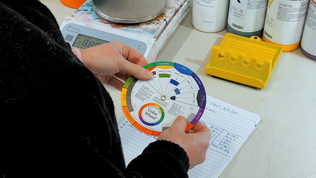
To get a perfect match, it helps to use a colour wheel. A colour wheel shows you which colours work well together and helps predict what will happen when you mix two colours. If you want to make a colour lighter, add white; if you need it darker, add black or a darker complementary colour. Colour theory can be your best friend when trying to recreate the perfect shade for your project.
Tip 2: Start with Small Batches and Take Notes
Always start small. When you first begin mixing your inks, it’s a good idea to work with small batches. This way, you can test the colour, see how it looks on your substrate, and make adjustments without wasting a lot of ink. Once you’ve nailed the perfect shade, you can then scale up to create a larger batch.
One of the most important habits to develop is note-taking. Write down everything you do while mixing inks, especially if you’re working on a client job and might need to recreate that exact colour in the future. Here’s what to track:
Ratios: Record the exact ratios of each colour used. For example, “2 parts blue, 1 part yellow” to create green. This ensures you can recreate that shade again.
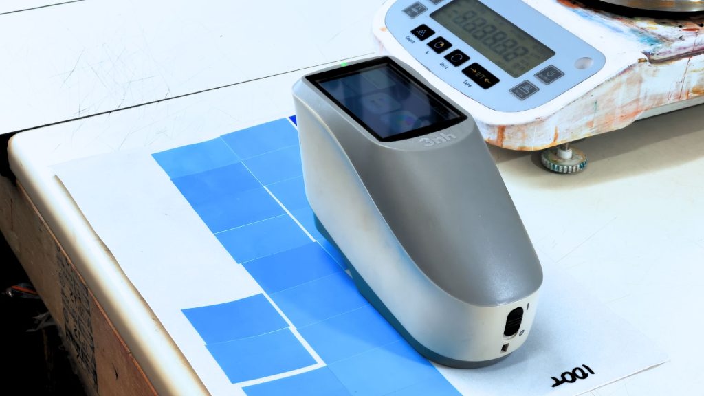
Swatches: Apply a small amount of the mixed ink to a piece of paper or fabric to create a swatch. Let it dry and keep it in your notes—sometimes colours change slightly as they dry, and you want to know what the final product will look like.
Adjustments: If you make changes, record those as well. You might start with a vibrant blue and find it needs a drop of white to get that pastel look. Keeping detailed notes ensures consistency for future runs.
Analogy: Think of note-taking like writing down a recipe in cooking. If you create an amazing sauce, you want to know how to replicate it, right? Ink mixing is just like that—you’re writing down your “recipe” for that perfect colour.
Tip 3: Test and Adjust Using the “Print Test” Method
One of the biggest challenges in colour matching is that ink can look different on the screen, in the bucket, and when printed on fabric. The colour in your mixing container might appear darker or lighter than it will once it’s printed and dried. That’s why you need to do a print test.
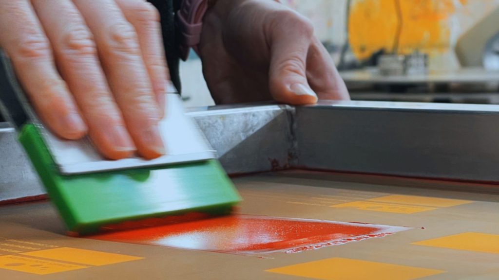
How to Do a Print Test
Mesh Count: Print the colour through the mesh count that you will be printing with during production. The mesh count can affect the colour of the ink (e.g. 43T vs 100T) due to how much ink is being deposited on the substrate.
Mix and Test on the Substrate: After mixing, use a small squeegee or brush to apply some of the ink onto a test piece of the same material you plan to print on. This is important because the texture and colour of your printing material can affect how the ink appears. For example, colours printed on dark fabrics will often look different compared to the same colours on white.
Dry and Evaluate: Allow the ink to dry completely before evaluating the colour. Colours tend to change slightly as they dry—some get darker, while others become more muted. If the colour is too bright, consider adding a touch of a complementary colour to mute it down. If it’s too dark, add a bit of white to brighten it up.
Lighting Conditions: Check your test prints in different lighting conditions—natural daylight, indoor lights, and any other lighting environment where your final product might be viewed. Colours can appear dramatically different depending on the lighting, so this step will help you ensure your colour matches correctly.
Analogy: Imagine buying paint for your house. When you see a colour swatch in the store, it looks great, but once it’s on the wall in your home, it might seem entirely different. Ink behaves in the same way—how it looks wet and dry can vary, and testing is the only way to be sure you’re getting the shade you want.
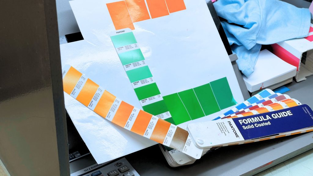
Putting It All Together
Mixing your own screen printing inks is like having a palette that allows you to bring your creative visions to life without limitations. By understanding basic colour theory, starting with small batches and taking careful notes, and testing on your substrate, you’ll be well on your way to mastering the art of colour matching.
Just remember:
Understand Colour Theory: Get familiar with primary, secondary, and tertiary colours. A colour wheel is a great tool.
Start Small and Record Everything: Small batches reduce waste, and detailed notes make replication easy.
Test, Test, Test: The “print test” method ensures your colours look perfect when printed and dry.
With these tips, you’re ready to start mixing your own custom colours confidently. So grab your primary inks, get your scoop coater ready, and start creating colours that make your designs pop!


